Imagine the possibility that you could control how your website is displayed when someone visit it in a smartphone or in a tablet, that is an awesome feature that it will do your visitors love you! Well, media queries, are an excellent way to change styles (images, backgrounds, colors, height, width, spacing, etc.) depending of the device that you are using to visit a website. This kind of techniques improve a lot the user experience and create a better opinion in your visitors about your site.
Since inclusion of new devices like smartphones or tablets, users have changed the way that they use web portals, right now thousands of people prefer to visit a website from their mobile device instead of use a personal computer, for this reason is too important create or adapt our pages to render them correctly and friendly on these devices. So, if you want to improve the user experience in your website maybe media queries will be really useful to give different “sights” to your visitors.
Media queries support
If you are asking yourself which web browsers support media queries you could find the next table very useful (for more details please visit: http://caniuse.com/#feat=css-mediaqueries):
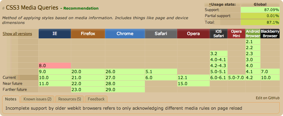
As you can see, the support is really good and maybe you are thinking about what happens with Internet Explorer, well, don’t worry about that because almost all devices (smartphones or tablets) have a good web browser and probably you won’t never have problems with this situation.
That’s it. If you need a complete article about this, please visit next link: https://wiki.base22.com/display/btg/Media+Queries
Be happy with your code!
—
Ady Erfüllt liked this on Facebook.
Raymundo Perez liked this on Facebook.