In this tutorial, we are going to be creating an awesome blog engine using two great tools: Angular and Carbon LDP.
This tutorial was inspired by the official one published by the Carbon LDP team in https://carbonldp.com/blog/2018/11/23/build-a-blog-with-carbon-ldp-and-react-part-1/
In order to successfully go through this tutorial, JavaScript and CSS knowledge is required.
Complementary source code is available in carbonldp-angular-blog repository.
In today’s part, we will be focusing on building the UI with Angular and Angular Material by using the Angular CLI.
The end goal
We know building a robust and powerful blog engine (such as WordPress) is not a trivial task, however, with these steps, you will be able to understand the concepts behind building applications with Carbon LDP and Angular.
Create the project skeleton using Angular CLI
Install the Angular CLI
sudo npm install -g @angular/cli
Create the new Angular app
ng new carbonldp-angular-blog
Answer the Angular CLI questions (we will use SCSS as pre-processor)
? Would you like to add Angular routing? (y/N) y
? Which stylesheet format would you like to use? SCSS
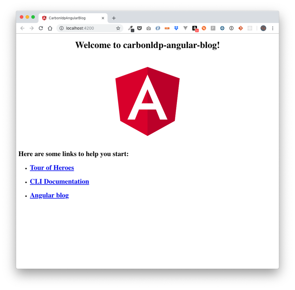
Once the scaffolding is done, run following command and this is how your fresh Angular app should look:
# This will run a local server in port 4200 by default, so please visit http:localhost:4200 to see your app

cd carbonldp-angular-blog
ng serve
If you take a look at the project structure, these are the file will appear:
.
├── README.md
├── angular.json
├── e2e
│   ├── protractor.conf.js
│   ├── src
│   └── tsconfig.e2e.json
├── package-lock.json
├── package.json
├── src
│   ├── app
│   ├── assets
│   ├── browserslist
│   ├── environments
│   ├── favicon.ico
│   ├── index.html
│   ├── karma.conf.js
│   ├── main.ts
│   ├── polyfills.ts
│   ├── styles.scss
│   ├── test.ts
│   ├── tsconfig.app.json
│   ├── tsconfig.spec.json
│   └── tslint.json
├── tsconfig.json
└── tslint.json
Add Angular Material
Installation
Since our main goal in this series is to focus on learning how Carbon LDP and Angular can work together, we will be using a set of proven components by Angular Material.
Let’s install our dependencies by following the official Angular Material documentation:
npm install --save @angular/material @angular/cdk @angular/animations
Configure animations
Open src/app/app.module.ts and import there the BrowserAnimationsModule
import { BrowserModule } from '@angular/platform-browser';
import { NgModule } from '@angular/core';

import { BrowserAnimationsModule } from '@angular/platform-browser/animations';
import { AppRoutingModule } from './app-routing.module';
import { AppComponent } from './app.component';

@NgModule({
  declarations: [
    AppComponent
  ],
  imports: [
    BrowserAnimationsModule,
    BrowserModule,
    AppRoutingModule
  ],
  providers: [],
  bootstrap: [AppComponent]
})
export class AppModule { }
Import the component modules
Let’s do a quick test using the “Button” module, for doing that, we need to import the corresponding module to our src/app/app.module.ts
import { MatButtonModule } from '@angular/material';
@NgModule({
  declarations: [
  // More components here...
  ],
  imports: [
    // More modules here...
    MatButtonModule
  ],
  providers: [],
  bootstrap: [AppComponent]
})
export class AppModule { }
Next, open src/app/app.component.html and remove everything except the router-outlet and add your brand new material button as follows:
<button mat-raised-button color="primary">Primary</button>
<router-outlet></router-outlet>
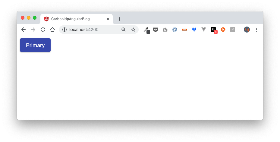
No errors in our console, but our button looks kind of sad… let’s add a material theme to make our material components beautiful.
Including a theme
Open src/styles.scss, and add this line to it:
/* You can add global styles to this file, and also import other style files */
@import "~@angular/material/prebuilt-themes/indigo-pink.css";
Go to your web browser, you should see your “primary” button with a blue background.
Adding Material Design icons
One of the easiest ways to add support for icons is by using a font, for doing that, open src/index.html and add a <link /> tag with the reference to the font family with Material Icons, this is how our src/index.html file will be after adding the icons.
<!doctype html>
<html lang="en">
<head>
  <meta charset="utf-8">
  <title>CarbonldpAngularBlog</title>
  <base href="/">

  <meta name="viewport" content="width=device-width, initial-scale=1">
  <link rel="icon" type="image/x-icon" href="favicon.ico">

  <!-- Adding support for icons -->
  <link rel="stylesheet" href="https://fonts.googleapis.com/icon?family=Material+Icons">
</head>
<body>
  <app-root></app-root>
</body>
</html>
For alternate ways for adding icons, please visit Angular Material documentation.
Implement a Basic Drawer
It is time to continue building our UI. Let’s create a “Layout” component within,src/components/layout this is really easy if we use the Angular CLI
ng generate component components/layout
The previous command will generate the following files; let’s open the src/app/components/layout/layout.component.html
src/app/components/
└── layout
    ├── layout.component.html
    ├── layout.component.scss
    ├── layout.component.spec.ts
    └── layout.component.ts
Add the Angular Material modules in src/app/app.module.ts
import {BrowserModule} from '@angular/platform-browser';
import {NgModule} from '@angular/core';

import {BrowserAnimationsModule} from '@angular/platform-browser/animations';
import {AppRoutingModule} from './app-routing.module';
import {AppComponent} from './app.component';

import {MatButtonModule, MatIconModule, MatSidenavModule, MatToolbarModule, MatNavList} from '@angular/material';
import {LayoutComponent} from './components/layout/layout.component';

@NgModule({
  declarations: [
    AppComponent,
    LayoutComponent,
    MatNavList,
  ],
  imports: [
    BrowserAnimationsModule,
    BrowserModule,
    AppRoutingModule,
    MatButtonModule,
    MatIconModule,
    MatSidenavModule,
    MatToolbarModule,
  ],
  providers: [],
  bootstrap: [AppComponent],
})
export class AppModule {}
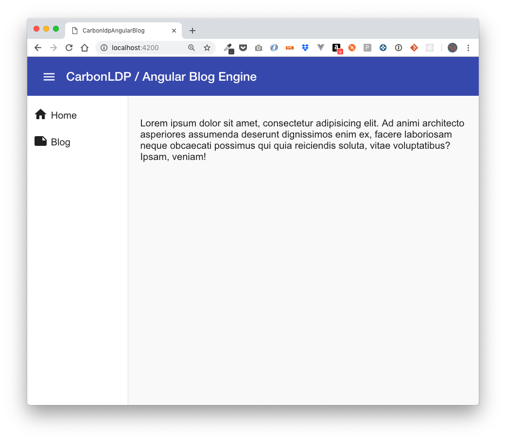
Open src/app/components/layout.component.html and paste this code:
<div class="layout-container" [class.example-is-mobile]="mobileQuery.matches">
  <mat-toolbar color="primary" class="example-toolbar">
    <button mat-icon-button (click)="snav.toggle()">
      <mat-icon>menu</mat-icon>
    </button>
    <h2 class="layout-app-name">CarbonLDP / Angular Blog Engine</h2>
  </mat-toolbar>

  <mat-sidenav-container class="layout-sidenav-container"
                         [style.marginTop.px]="mobileQuery.matches ? 56 : 0">

    <mat-sidenav #snav [mode]="mobileQuery.matches ? 'over' : 'side'"
                 [fixedInViewport]="mobileQuery.matches" fixedTopGap="56">

      <mat-nav-list>
        <div class="b-button-container">
          <a class="b-button" mat-list-item routerLink=".">
            <i class="b-button__icon material-icons">home</i>
            <span class="b-button__label">Home</span>
          </a>
        </div>

        <div class="b-button-container">
          <a class="b-button" mat-list-item routerLink=".">
            <i class="b-button__icon material-icons">note</i>
            <span class="b-button__label">Blog</span>
          </a>
        </div>
      </mat-nav-list>

    </mat-sidenav>

    <mat-sidenav-content>
      <div class="b-content">
        <p>Lorem ipsum dolor sit amet, consectetur adipisicing elit. Ad animi architecto asperiores assumenda deserunt
          dignissimos enim ex, facere laboriosam neque obcaecati possimus qui quia reiciendis soluta, vitae
          voluptatibus?
          Ipsam, veniam!</p>
      </div>

    </mat-sidenav-content>

  </mat-sidenav-container>
</div>
In addition, let’s create some styles in src/app/components/layout.component.scss
.layout-container {
  display: flex;
  flex-direction: column;
  position: absolute;
  top: 0;
  bottom: 0;
  left: 0;
  right: 0;
}

.layout-is-mobile .layout-toolbar {
  position: fixed;
  /* Make sure the toolbar will stay on top of the content as it scrolls past. */
  z-index: 2;
}

.layout-app-name {
  margin-left: 8px;
}

.layout-sidenav-container {
  /* When the sidenav is not fixed, stretch the sidenav container to fill the available space. This
     causes `<mat-sidenav-content>` to act as our scrolling element for desktop layouts. */
  flex: 1;
}

.layout-is-mobile .layout-sidenav-container {
  /* When the sidenav is fixed, don't constrain the height of the sidenav container. This allows the
     `<body>` to be our scrolling element for mobile layouts. */
  flex: 1 0 auto;
}

.b-button-container {

  .b-button {
    display: block;
    min-height: 34px;
    min-width: 145px;
    padding: 5px 10px;
  }

  .b-button__icon {
    margin-top: 5px;
    margin-right: 5px;
    display: block;
    float: left;
  }

  .b-button__label {
    margin-top: 10px;
    display: block;
    float: left;
  }
}

.b-content {
  padding: 20px;
}
And modify the src/styles.scss
/* You can add global styles to this file, and also import other style files */
@import "~@angular/material/prebuilt-themes/indigo-pink.css";

body {
  font-family: Roboto, Arial, sans-serif;
  margin: 0;
}
Checkpoint: let’s see how our app is looking so far and make a commit to our Git repository.
Implement navigation routes
It is time, to start thinking in our navigation routes, for instance, we will have